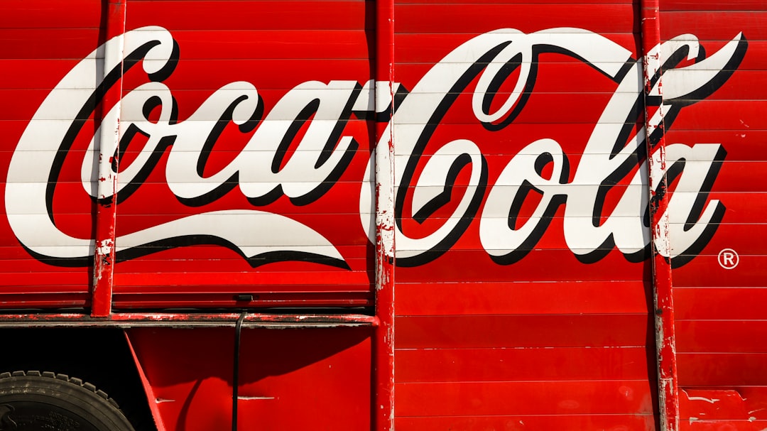
The logo of a brand is often the first point of contact between a company and its customers. Coca-Cola, one of the world’s most recognizable brands, has a logo that is not only iconic but also steeped in history. The evolution of the Coca-Cola logo design offers a fascinating insight into the brand’s journey from its inception to the present day.
Early Beginnings
The Coca-Cola logo dates back to the late 19th century when the drink was first created by John Pemberton in 1886. The initial logo, designed by the bookkeeper Frank Robinson, featured Coca-Cola written in elaborate Spencerian script. This script, with its intricate loops and curves, gave the logo a sense of elegance and sophistication that resonated with consumers of that era.
However, as the Coca-Cola brand grew in popularity, the need for a more standardized and easily recognizable logo became apparent. In 1893, the company introduced a new logo that featured a more streamlined version of the Spencerian script. This design, while still retaining the essence of the original script, was easier to reproduce on a larger scale, such as on billboards and advertising materials.
Modernization and Innovations
Throughout the 20th and 21st centuries, the Coca-Cola logo underwent several updates and modifications to keep up with changing design trends and consumer preferences. One of the most significant changes came in 1958 when the company introduced the iconic red disc behind the logo. This red disc, known as the “Dynamic Ribbon Device,” added a visually striking element to the logo and further solidified Coca-Cola‘s brand identity.
In 1985, Coca-Cola decided to overhaul its logo completely with the introduction of the “New Coke” formula and a redesigned logo. The new logo featured a bolder and more modern font, signaling a departure from the traditional script style. However, the backlash from consumers led the company to reintroduce the original formula and logo as “Coca-Cola Classic,” showcasing the enduring power of the brand’s iconic logo.
Global Impact and Recognition
The Coca-Cola logo is not only a symbol of a popular beverage but also a cultural icon that transcends borders and languages. The distinct red and white color scheme, combined with the timeless font, has made the Coca-Cola logo instantly recognizable worldwide.
For example, in countries where the Latin alphabet is not commonly used, such as Japan or China, Coca-Cola has adapted its logo to maintain its visual identity while also respecting local customs and traditions. This flexibility and cultural sensitivity have enabled Coca-Cola to establish a global presence while staying true to its core branding elements.
The Coca-Cola logo has stood the test of time, evolving with the brand’s growth and adapting to changing design trends. From its humble beginnings in the late 19th century to its global recognition today, the Coca-Cola logo continues to be a testament to the power of effective branding and design. As consumers around the world raise a glass of Coca-Cola, the iconic logo stands as a reminder of the brand’s rich history and enduring appeal.

